

Kalleda Mangoes | Food & Beverage
CLIENT NAME: Ram Mohan Errabelli
JOB: Brand Identity, Package Design & Digital Media Design
Creative Direction: Vydika Rao
Year: 2017


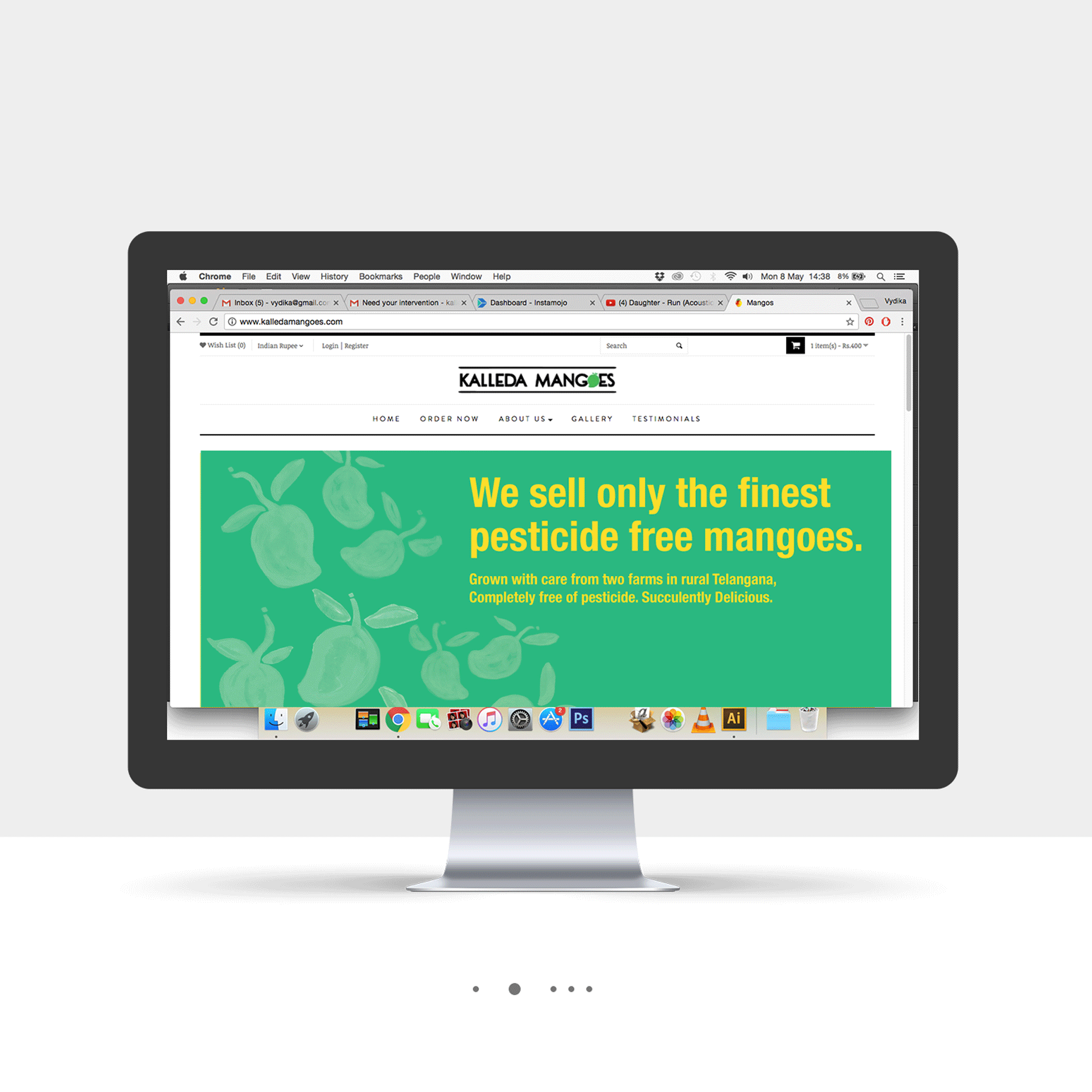
OVERVIEW: We were tasked with a holistic branding job to help launch the client's produce business of farm-grown pesticide-free Mangoes. The mangoes were renowned for their taste.
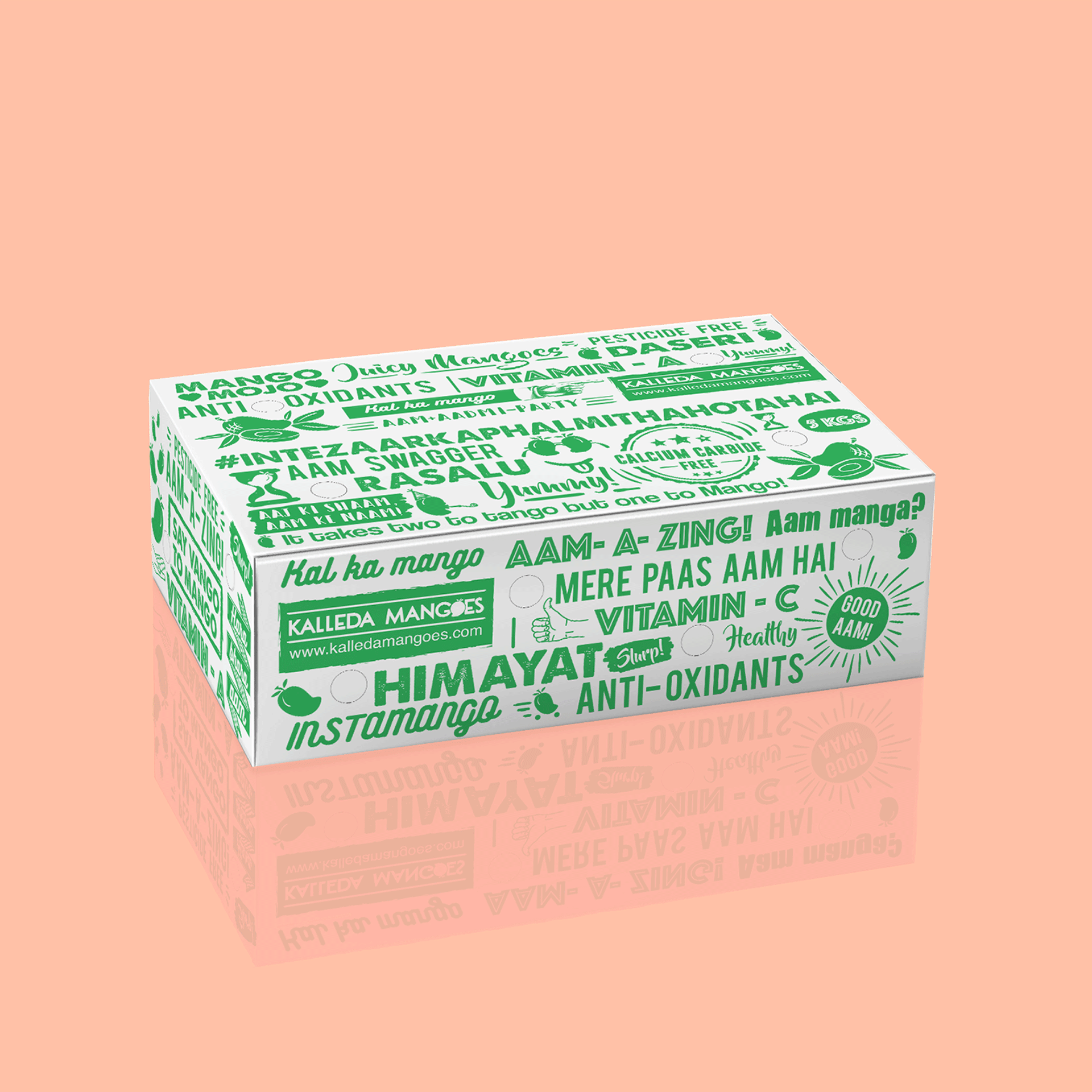
Logo Design: We took up all aspects of launching this brand. From design to copy, social media, sales, marketing and even logistics. The logo was a simple word mark logo that was straightforward and literal. But we compensated by building the personality of the brand in their packaging and social media design. We used typography with a little bit of humour across the entire box to create fun packaging. The audience enjoyed the packaging and the little hidden jokes we included. It was important for the packaging to be slightly informative, so we also integrated the health benefits and the types of mangoes available at Kalleda Mangoes.


Print & Digital Media Design
We played with the words "Aam", "Mango", and "Manga" to put a fun spin on the seasonal product. Across all digital and print campaigns we had fun visual parodies on cinema and political references which helped build humour around the product. The Brochure we designed focused on building trust towards the seasonal product and the brand by sharing visual information about the farming process.


